Colour is a powerful tool in the world of design. It can make your design more visually appealing and communicate emotions and messages. This is where colour psychology comes in.
Colour psychology is the study of how colours impact human behaviour, emotions, and perceptions. By understanding the basics of colour psychology, you can create designs that are more impactful and engaging.
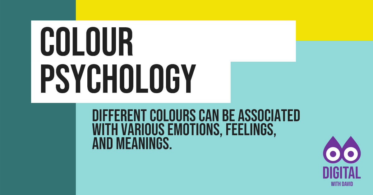
Examples of colour psychology
Different colours can be associated with various emotions, feelings, and meanings.
- Red: passion, excitement, love, energy, danger
- Orange: warmth, creativity, friendliness, excitement
- Yellow: happiness, optimism, clarity, caution
- Green: growth, harmony, nature, stability
- Blue: calmness, trust, intelligence, professionalism
- Purple: luxury, creativity, spirituality, mystery
- Pink: love, compassion, gentleness, sweetness
- Brown: earthiness, warmth, stability, reliability
- Black: power, sophistication, mystery, elegance
- White: purity, innocence, cleanliness, simplicity
- Gray: neutrality, balance, sophistication, formality
Practical tips
Here are some tips to help you incorporate colour psychology into your designs:
Consider the mood you want to create
Different colours can evoke different emotions and moods. For example, blue is often associated with calmness and trust, while red is associated with passion and excitement. Think about the mood you want to convey and choose colours that align with it.
Be mindful of cultural associations
Different cultures may have different associations with colours. For example, white is often associated with purity and innocence in Western cultures, while in some Eastern cultures, it is associated with mourning. Consider the cultural context of your design and choose appropriate colours.
Use contrasting colours to create emphasis
Contrasting colours can create visual interest and draw attention to essential elements of your design. For example, using a bright colour against a dark background can create a strong contrast and make the text or image stand out.
Use colours consistently
Consistency is key to creating a strong brand identity. Choose a colour palette and use it consistently across your website or graphic design. This will help your brand be more recognizable and memorable.
Keep reading