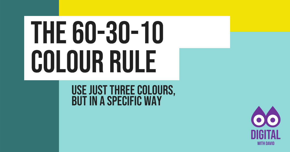
What is the 60-30-10 colour rule?
Use the 60-30-10 colour rule to create visually appealing colour schemes by using a combination of just three colours in a specific way.
The three colours are:
- Dominant colour (60%)
- Secondary colour (30%)
- Accent colour (10%)
The dominant colour should be the main colour used in the design and cover 60% of the space. The secondary colour should be a complementing colour that covers 30% of the space. The accent colour should be a contrasting colour that is used sparingly to add interest and draw attention to specific elements.
How to apply the 60-30-10 colour rule to your designs
Choose your dominant colour
Start by selecting a dominant colour that will be the primary colour of your design. This colour should represent the main message or mood that you want to convey. Consider using a colour that is closely associated with your brand.
Pick your secondary colour
Next, choose a secondary colour that complements your dominant colour. This colour should be used to create contrast and provide visual interest. It could be a darker or lighter shade of your dominant colour or a colour that is opposite on the colour wheel.
Add your accent colour
Finally, choose an accent colour that contrasts with your dominant and secondary colours. This colour should be used sparingly to draw attention to specific elements, such as call-to-action buttons or links. It could be a bright or bold colour that stands out from the rest of the design.
Test your colour scheme
Once you have selected your colours, test your colour scheme to ensure that it looks visually appealing and balanced.
Consider using colour palette generators or tools like Adobe Colour to help you choose complementary colours.
Example colour schemes if the dominant colour is red
Red, white, and black: This classic colour combination is simple and elegant. This colour scheme works well for designs that want to convey a bold and striking message.
Red, yellow, and orange: This colour combination is warm and vibrant. This colour scheme works well for designs that want to convey a sense of energy and excitement.
Red, green, and blue: This colour combination is cool and calming. This colour scheme works well for designs that want to convey a sense of stability and trust.
Example colour schemes if the dominant colour is green
Green, blue, and grey: This colour combination is calming and natural. This colour scheme works well for designs that want to convey a sense of relaxation and balance.
Green, purple, and pink: This colour combination is playful and feminine. This colour scheme works well for designs that want to convey a sense of creativity and fun.
Green, yellow, and orange: This colour combination is bright and energetic. This colour scheme works well for designs that want to convey a sense of enthusiasm and excitement.
Example colour schemes if the dominant colour is blue
Blue, white, and grey: This colour combination is clean and calming. This colour scheme works well for designs that want to convey a sense of professionalism and trustworthiness.
Blue, orange, and yellow: This colour combination is bold and vibrant. This colour scheme works well for designs that want to convey a sense of energy and excitement.
Blue, green, and purple: This colour combination is harmonious and relaxing. This colour scheme works well for designs that want to convey a sense of calmness and tranquillity.
Example colour schemes if the dominant colour is black
Black, white, and grey: This colour combination is classic and timeless. This colour scheme works well for designs that want to convey a sense of sophistication and elegance.
Black, gold, and silver: This colour combination is luxurious and glamorous. This colour scheme works well for designs that want to convey a sense of prestige and high-end quality.
Black, red, and orange: This colour combination is bold and striking. This colour scheme works well for designs that want to convey a sense of excitement and energy.
Colour psychology
Closely associated with the 60-30-10 colour rule is colour psychology.
This is the study of how colours can affect human behaviour, emotions, and perceptions. It is the idea that colours have a psychological and emotional impact on people and that certain colours can evoke specific reactions or feelings.
For example, red is often associated with passion, energy, and excitement, while blue is often associated with calmness, trust, and stability. Different cultures may also have different associations with colours, which can influence how they are used in branding, advertising, and design.
Keep reading